Guide
Website Accessibility for Small Businesses: A Plain-English Guide
Accessibility sounds like a compliance chore reserved for governments and giant corporations. It isn’t. It’s a set of mostly simple habits that make your website usable by more of your customers — and this guide explains them without the jargon.
Website accessibility means building your site so people with disabilities — and anyone using a screen reader, a keyboard, a zoomed-in phone, or aging eyes — can actually read it, navigate it, and buy from it. The practical target most organizations aim for is WCAG 2.1 Level AA, a public checklist maintained by the W3C. For a small business, the biggest wins are surprisingly basic: readable color contrast, descriptive alt text on images, labeled forms, a logical heading order, and a site you can operate with the Tab key. Accessibility also overlaps heavily with good SEO and good design, so the work pays for itself twice.
What does website accessibility actually mean?
An accessible website is one that works for people regardless of how they see, hear, move, or process information. A visitor using a screen reader hears your page read aloud, so images need text descriptions and headings need to be real headings, not just big bold text. A visitor with limited hand mobility navigates with a keyboard or voice control, so every button and menu has to be reachable without a mouse. A visitor with low vision zooms the page to 200% or relies on strong color contrast to tell text from background.
The part most owners miss: this is not a small edge case you can safely ignore. The CDC reported in 2024 that more than one in four US adults — over 70 million people — live with some form of disability, and that’s before you count the situational versions everyone experiences — a cracked phone screen, bright sunlight on a patio, a sprained wrist, trying to watch a video in a quiet waiting room. Accessible design serves all of it.

Permanent
Blindness and low vision, deafness, limited mobility, cognitive differences like dyslexia or ADHD. These visitors rely on assistive tech — screen readers, magnifiers, switch devices — that only works when your site is built properly underneath.
Temporary
An eye infection, a broken arm, recovery after surgery, new-parent one-handed phone use. Temporary limitations put ordinary customers in exactly the same position as permanent ones — usually right when they need to reach you.
Situational
Glare on a phone outdoors, a muted video on a bus, slow rural internet, gloves in winter. Every visitor is “situationally disabled” sometimes, which is why accessible sites simply convert better for everyone.
Why accessibility is worth a small business’s time
Most advice on this topic leads with fear of lawsuits. That’s real (more below), but it’s the weakest of the three reasons to care:
1
You stop turning customers away
An inaccessible site quietly loses sales you never see — the visitor who couldn’t read your gray-on-white phone number, or couldn’t submit your unlabeled contact form. Fixing those barriers is straightforward revenue recovery.
2
The same work improves SEO
Search engines read your site much the way a screen reader does: headings, alt text, link labels, page structure. Accessible markup is also crawlable markup, and fast, readable pages hold visitors longer. It’s one job with two payoffs.
3
It’s a genuine differentiator
Accessibility is rare enough to stand out. WebAIM’s 2026 analysis of the top one million home pages detected WCAG 2 failures on 95.9% of them. Being in the other 4% is an advantage most of your competitors haven’t bothered to claim.
The same WebAIM study found an average of 56 distinct errors per home page, and low-contrast text on 83.9% of them — worth remembering, because it means the most common failures are also the easiest ones to fix.
The legal picture, in plain language
First, the necessary honesty: we’re web designers, not lawyers, and nothing here is legal advice. If you want to know your specific obligations, consult an attorney who works in this area. What we can do is describe the landscape in plain English.
The Americans with Disabilities Act (ADA) requires businesses that are open to the public to be accessible to people with disabilities, and the Department of Justice has published guidance stating its long-held position that this applies to those businesses’ websites, not just their buildings. For state and local governments, the DOJ went further: a 2024 rule explicitly requires their web content to meet WCAG 2.1 Level AA. There is no equivalent fixed technical standard written into regulation for private small businesses yet — which is why courts, demand letters, and settlements overwhelmingly point to that same WCAG 2.1 AA benchmark as the reference.
In practice, the risk most small businesses actually encounter is not a courtroom drama but a demand letter: a law firm scans sites with automated tools, finds failures, and sends a settlement demand. Whether any particular claim would hold up is a question for your counsel — but the cheapest response to that whole category of risk is a site without the failures those scans look for. The fixes below close the most commonly cited gaps.
Two takeaways worth keeping: accessibility work is protective in a way that’s useful regardless of how the law evolves, and “we didn’t know” has never been much of a strategy. Treat WCAG 2.1 AA as the working target, document the improvements you make, and talk to a lawyer about anything beyond that.
WCAG basics, translated from standards-speak
WCAG — the Web Content Accessibility Guidelines, maintained by the W3C — is the checklist nearly everyone measures against. It’s long and written for specialists, but its entire structure hangs on four ideas with a memorable acronym: POUR.
Perceivable
Everyone can take in your content. Images carry text alternatives, videos carry captions, text has enough contrast against its background, and nothing depends on color alone (“errors are shown in red” fails for the colorblind visitor).
Operable
Everyone can work the controls. The whole site is usable with a keyboard alone, nothing traps focus, targets are big enough to tap, nothing flashes dangerously, and visitors get enough time to finish what they started.
Understandable
Content and behavior make sense. Plain language over jargon, navigation that stays in the same place on every page, form fields that say what they want, and error messages that explain how to fix the problem.
Robust
The site is built on clean, standard code that assistive technologies can interpret — real buttons instead of clickable divs, real headings instead of styled text, valid HTML underneath the design.
A, AA, AAA — the three conformance levels
Every WCAG rule is graded. Level A is the floor: failures here lock people out entirely, like images with no alternative text on a page you can’t navigate by keyboard. Level AA adds the requirements that make a site genuinely usable — the 4.5:1 contrast minimum for body text, visible keyboard focus, consistent navigation — and it’s the level regulators, courts, and procurement checklists almost always reference. Level AAA is the specialist tier (sign-language interpretation, 7:1 contrast) that even the W3C doesn’t recommend requiring for entire sites. For a small business, “aim for AA” is the whole strategy.
Ten quick wins you can fix this week
You don’t need a specialist to clear the most common failures. These ten fixes address the barriers automated scans flag most often, roughly in order of impact for effort:
- Fix low-contrast text. Light gray on white is the web’s most common failure. Run your brand colors through a free contrast checker; body text needs at least 4.5:1 against its background.
- Write alt text for meaningful images. Describe what the image communicates (“Our patio seating at sunset”), not “IMG_4032”. Purely decorative images get an empty alt attribute so screen readers skip them.
- Use headings in order. One H1 per page, then H2s for sections, H3s inside them — no skipping levels, and never choosing a heading just because of its font size.
- Label every form field. Placeholder text that disappears when you click is not a label. Each field needs a real label a screen reader can announce.
- Make link text say where it goes. “View our service menu” beats “click here” — for screen-reader users jumping link to link, and for search engines too.
- Do the Tab-key test. Put down the mouse and Tab through your homepage. Can you reach every menu, button, and form? Can you always see which element is focused? If not, that’s a real barrier.
- Caption your videos. Captions serve deaf visitors, plus everyone watching muted — which on social media is most people.
- Don’t rely on color alone. Pair color signals with words or icons: “Sold out” as text, not just a red border.
- Check your mobile tap targets. Tiny close buttons and cramped menu links fail visitors with tremors, big thumbs, or bumpy bus rides alike.
- Respect motion settings. Auto-playing carousels and heavy animation should pause or calm down for visitors whose devices ask for reduced motion.
A realistic path from “never thought about it” to accessible
Accessibility fails when it’s treated as a one-time certification project. It sticks when it’s a short sequence you actually finish, then a habit you keep. Here’s the whole path:
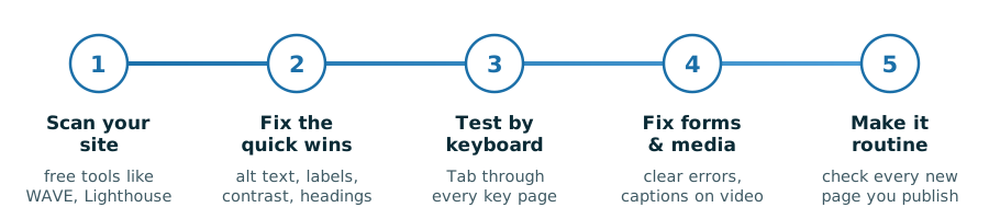
Notice what’s not on the timeline: buying a plugin that promises instant compliance. Real accessibility lives in your site’s actual code and content, which is why the path runs through fixing things rather than overlaying them.
How to test your website for free
You can get a solid read on your site’s accessibility in an afternoon without spending anything:
- WAVE (wave.webaim.org) — paste in your URL and get a visual overlay of errors, contrast failures, and structural issues, annotated right on your page.
- Lighthouse — built into Chrome’s developer tools; its accessibility audit scores any page and links each finding to an explanation.
- axe DevTools — the free browser extension behind many professional audits; excellent, plain-worded explanations of each issue.
- The keyboard test — no tool at all: Tab, Shift+Tab, Enter, and arrow keys through your most important pages, mouse untouched.
- The zoom test — set your browser to 200% zoom. Text should reflow and stay readable, with nothing overlapping or cut off.
- A screen reader, briefly — VoiceOver ships free on every Mac and iPhone, Narrator on Windows. Ten minutes of listening to your own homepage is the fastest empathy lesson in web design.
One important caveat: automated scanners catch only a fraction of accessibility problems — roughly the mechanical third. They can verify an image has alt text but not whether the alt text is useful; they can measure contrast but can’t tell you your checkout flow is confusing. Use the tools to find the obvious failures, then use the keyboard and screen-reader tests to judge the experience.
A word about “accessibility overlay” widgets
You’ll meet vendors selling a one-line snippet that claims to make any site instantly compliant — usually a floating accessibility icon that opens a settings panel. Treat these with healthy skepticism. Overlays can’t fix problems that live in your site’s underlying code, many screen-reader users report they interfere with the assistive tech they already use, and sites running overlays continue to receive accessibility demand letters. There’s no shortcut around building the page properly — and as the quick-wins list above shows, building it properly is less work than the shortcut vendors imply.
FAQWebsite accessibility — common questions
What is ADA compliance for a website?
It means your website doesn’t exclude people with disabilities, consistent with the Americans with Disabilities Act’s requirement that businesses open to the public be accessible. There’s no fixed technical standard written into regulation for private business websites, but courts, the Department of Justice, and settlement agreements consistently reference WCAG 2.1 Level AA as the benchmark. For your specific legal obligations, consult an attorney.
Do small business websites have to be accessible?
The Department of Justice’s position is that the ADA’s accessibility requirements apply to the websites of businesses open to the public, and small businesses do receive accessibility demand letters. How the law applies to your specific situation is a question for a lawyer — but the practical answer is that accessibility is worth doing regardless, because it enlarges your customer base, improves SEO, and removes the failures automated legal scans look for.
What is WCAG 2.1 Level AA in simple terms?
WCAG is the public checklist for web accessibility, maintained by the W3C. Level AA is its middle conformance tier — the one nearly everyone means by “accessible.” In practice it requires things like readable color contrast (4.5:1 for body text), text alternatives for images, captions for video, full keyboard operability, visible focus indicators, properly labeled forms, and a logical heading structure.
How do I check if my website is accessible?
Start with free automated tools: WAVE, the Lighthouse audit built into Chrome, or the axe DevTools extension. Then do two manual checks — navigate your key pages with only the Tab key, and browse them at 200% zoom. Automated scanners catch roughly the mechanical third of problems, so the manual tests matter. For a legally significant assessment, hire a professional auditor.
Do accessibility overlay widgets make my site compliant?
No tool that adds a floating settings icon can fix problems in your site’s underlying code, and sites using overlays continue to receive accessibility demand letters. Some screen-reader users report overlays actively interfere with their assistive technology. Overlays can be a minor supplement, but genuine accessibility comes from fixing contrast, alt text, labels, headings, and keyboard support in the site itself.
Does website accessibility help SEO?
Substantially, because the two disciplines share their foundations. Search engines parse your site much like a screen reader does: descriptive headings in order, alt text on images, meaningful link labels, and clean page structure all serve both. Accessibility work also tends to improve page speed and readability, which affect how long visitors stay — another signal search engines notice.